

How to Improve Website UX to Reduce Bounce Rate
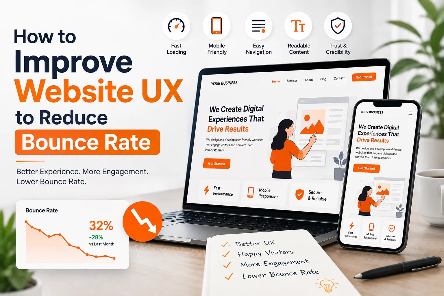
Key takeaways
- Bounce rate is not just a number on Google Analytics.
- Speed is the single biggest factor behind high bounce rates.
- Confusing navigation is one of the fastest ways to lose a user.
- More than half of all website traffic today comes from phones.
Every website owner checks bounce rate at some point and feels a little worried. A visitor lands on your page and leaves within seconds. No click. No scroll. No interest. This happens more often than most people think and the real reason is almost always user experience. When a website feels slow, confusing, or hard to use, people leave without a second thought. Good news is this problem can be fixed with the right approach and small, consistent changes to how your site looks and behaves.
Why Bounce Rate and UX Are Connected
Bounce rate is not just a number on Google Analytics. It reflects how people feel the moment they open your site. If the experience feels smooth, they stay. If it feels rough, they go somewhere else.
What Affects a Visitor's First Impression
- Page load speed
- Layout and visual clarity
- Font size and readability
- Mobile responsiveness
- Navigation structure
- Trust signals like reviews and contact details
A website that gets even two or three of these wrong can lose a visitor in under ten seconds. This is why teams that focus on improve website UX bounce rate strategies usually see a real drop in exit numbers within weeks, not months.
Fix Your Page Load Speed First
Speed is the single biggest factor behind high bounce rates. Studies again and again show that a delay of just two to three seconds pushes visitors away. People do not wait anymore. They expect instant results.
Quick Ways to Improve Speed
- Compress and resize all images before upload
- Remove unused plugins, scripts, and widgets
- Use lazy loading for images below the fold
- Choose fast, reliable hosting
- Enable browser caching
- Minify CSS and JavaScript files
A fast site is not a luxury anymore. It is the baseline expectation for every visitor who clicks on your link.
Design a Clear and Simple Navigation
Confusing navigation is one of the fastest ways to lose a user. If someone cannot find what they came for in a few seconds, they simply close the tab.
Navigation Best Practices
- Keep the main menu short and focused
- Use clear labels instead of clever or vague words
- Add a visible search bar for larger sites
- Keep important pages within two clicks
- Use breadcrumbs on deep pages
- Highlight the current page in the menu
Simple navigation removes friction. And friction is exactly what pushes bounce rate up.
Use Mobile-First Design
More than half of all website traffic today comes from phones. If your site feels awkward or broken on mobile, you are losing a huge chunk of visitors before they even see your content.
Mobile UX Checklist
- Buttons should be large enough to tap easily
- Text should be readable without zooming
- Forms should be short and simple to fill
- Pop-ups should not block the whole screen
- Images should resize properly on smaller screens
Businesses that invest in solid UI and UX design usually build mobile-first from day one rather than fixing it later. This saves time and keeps the experience consistent across devices.
Improve Content Readability
Even a well-designed website can push people away if the content is hard to read. Dense paragraphs, small fonts, and poor spacing all hurt readability.
Ways to Make Content Easier to Read
- Break text into short paragraphs
- Use bullet points and numbered lists often
- Choose a font size that works on all screens
- Add enough white space between sections
- Use subheadings to guide the reader
- Avoid long blocks of text without breaks
People skim before they read. If your content is not skim-friendly, they will bounce before reaching your main message.
Add Clear Calls to Action
A confused visitor is a visitor who leaves. Every page should tell the user exactly what to do next.
Elements of a Strong CTA
- Use action words like get started or book now
- Keep the button visible without scrolling too far
- Use a color that stands out from the page
- Avoid placing too many CTAs on one page
- Make the CTA text specific, not generic
A clear next step keeps visitors engaged and reduces the chance they leave out of confusion.
Reduce Pop-ups and Intrusive Elements
Pop-ups can help with conversions but too many of them ruin the experience. If a visitor is interrupted before they even read your headline, they are likely to leave right away.
Smarter Pop-up Practices
- Delay pop-ups by a few seconds
- Avoid full-screen pop-ups on mobile
- Limit pop-ups to one per session
- Use exit-intent triggers instead of instant pop-ups
- Make the close button easy to find
A website that respects the visitor's attention naturally keeps bounce rate lower.
Test and Optimize Continuously
UX is never a one-time fix. What works today might not work in six months as user behavior and devices change.
Ongoing Testing Steps
- Run A/B tests on key pages
- Track heatmaps to see where users click
- Review analytics for high exit pages
- Collect direct feedback from real users
- Update design based on real data, not guesses
Teams that treat UX as an ongoing process instead of a one-time project usually see steady, long-term improvement in engagement. Working with a dedicated website design and development partner makes this easier since testing and updates happen alongside development.
Conclusion
Reducing bounce rate is not about one big redesign. It is about fixing small friction points that add up over time. Faster load speed, clear navigation, mobile-friendly layouts, readable content, and thoughtful calls to action all work together to keep visitors on your page longer. Once these pieces are in place, people stop leaving out of frustration and start actually engaging with what you offer.
FAQ
What is a good bounce rate for a website?
A bounce rate between thirty and fifty percent is generally considered healthy for most websites. Anything above seventy percent usually points to a UX or content problem that needs attention.
Does page speed really affect bounce rate that much?
Yes. Even a one second delay can noticeably increase the chance a visitor leaves. Speed is one of the fastest ways to improve engagement.
How often should I test my website UX?
Ideally every few months, or whenever you notice a spike in bounce rate. User behavior changes over time so regular testing keeps your site aligned with real expectations.
Can bad mobile design alone increase bounce rate?
Yes, very easily. Since most traffic today comes from mobile devices, a broken or clunky mobile experience can push bounce rate up significantly on its own.
Is bounce rate the only metric I should track for UX?
No. Bounce rate is useful but should be viewed alongside time on page, scroll depth, and conversion rate for a complete picture of user experience.
About the author

Sr. SEO Executive · 3 years' experience
Harsh Rajput is a Senior SEO Executive with 3+ years of experience in SEO, digital marketing and AEO/GEO strategy. He leads a team of SEO executives at Digisutra Solutions, handling keyword research, technical SEO, on-page/off-page optimization, link building and content strategy, while helping brands rank in Google AI Overviews and LLM platforms like ChatGPT, Claude and Gemini. He has worked with clients across India, USA, UAE, and Australia in industries like e-commerce, finance and technology.
Reader reviews

Up next · SEO & AI search · 20 min
Google Latest SEO Updates October 2026: What Changed and What to Do

Related · AI automation · 20 min
AI Project Planning: How to Scope an AI Project Before Writing Code