

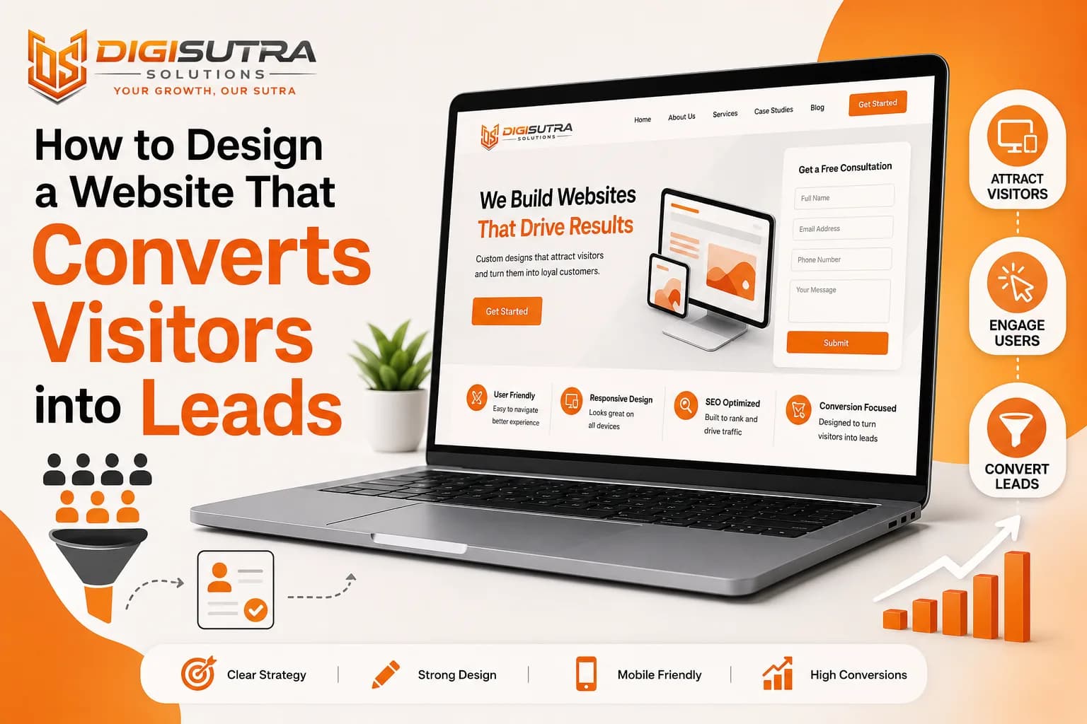
How to Design a Website That Converts Visitors into Leads
Key takeaways
- A website converts visitors into leads when it loads in under three seconds says what you do in plain words gives one clear next step on every page shows proof next to every ask and keeps the first form to three fields or fewer.
- A lead generation website is a site built to collect enquiries rather than just display information.
- A high converting website does four jobs in order.
- Most businesses answer a lead problem by spending more on ads.
Most websites look fine and still bring in almost nothing. Traffic comes in. People scroll a bit. Then they leave and never come back.
The problem is rarely the traffic. It is what happens in the first ten seconds after someone lands on your page. A visitor decides very fast whether you are worth their time. If your page makes them think or guess what to do next you have already lost them.
A website that brings in leads is built around one simple idea. Make it easy for the right person to take the next step. Everything else supports that. Layout, copy, speed, forms, colours. All of it either helps someone act or gets in the way.
This guide covers the changes that actually move the number. No theory. Just what makes the difference between a site that looks good and a site that fills your inbox.
How to Design a Website That Converts Visitors into Leads
A website converts visitors into leads when it loads in under three seconds says what you do in plain words gives one clear next step on every page shows proof next to every ask and keeps the first form to three fields or fewer.
The full method in nine steps:
Pick one goal per page
Write a headline that names the visitor's problem
Get load time under three seconds on mobile data
Offer something worth an email address
Put a clear button in the hero and repeat it down the page
Cut the form to three fields
Place proof beside every ask
Reply within one hour
Test one change at a time and measure per page
What Is a Lead Generation Website
A lead generation website is a site built to collect enquiries rather than just display information. Every page has a job. Every job points to the same place. A form a call a booking or a chat.
A brochure site tells people you exist. A lead generation site moves someone from a search result to a conversation.
The difference shows up in the structure not the design:
A brochure site has an About page as the main story. A lead site has service pages as the main story
A brochure site has one contact form buried in the menu. A lead site puts a next step on every page
A brochure site measures visits. A lead site measures enquiries per page
A brochure site is finished at launch. A lead site is edited every month based on what people actually do
What Counts as a Lead
Before you design anything decide what a lead means for your business. Teams argue about conversion numbers because nobody wrote this down.
Common lead events for a service business:
A form submitted
A phone call from the website or a click to call
A WhatsApp message started
A calendar slot booked
A quote or price request
A meaningful chat conversation handed to a human
Newsletter signups and PDF downloads are useful but they are not the same thing. Track them separately or your reporting will look great while your sales team sits idle.
What Makes a Website Convert
A high converting website does four jobs in order. It loads fast. It says what you do. It proves you can be trusted. It makes the next step obvious.
Miss one of those and the rest stops working. A beautiful site that takes eight seconds to load converts nobody. A fast site with a vague headline converts nobody either.
The five things every high converting site gets right
One clear goal per page so the visitor never has to pick between five options
A headline that names the problem the visitor came to solve
Load time under three seconds on mobile data not office wifi
Proof placed next to every ask in the form of reviews numbers or client names
A short form that asks only for what you need to make the first call
Strong website design for lead generation starts here. Get these five right before you touch fonts or colours.
Why Fixing Conversion Beats Buying More Traffic
Most businesses answer a lead problem by spending more on ads. Doing the maths usually kills that idea.
Say your site gets 10,000 visits a year at a 1 percent conversion rate. That is 100 enquiries. You want 300.
You have two options:
Triple the traffic. You now need 30,000 visits. That means roughly three times the ad spend or two more years of content and links
Triple the conversion rate. You move from 1 percent to 3 percent by fixing the headline the speed and the form. Traffic stays the same. Cost is close to zero after the fix
The second option is faster and cheaper almost every time. It also makes every future rupee or dollar of ad spend work harder because the page behind the ad is better.
This is why a conversion fix should always come before a traffic push.
Get the Right Traffic Before You Fix the Page
Sometimes the page is fine and the audience is wrong. A page selling enterprise software will convert badly if most visitors are students looking for a free tool.
Check this before you rebuild anything:
Open your analytics and sort pages by enquiries not visits
Find which pages bring enquiries and which bring only reading
Look at which channels those enquiries came from
List your five best clients and note what they searched for before they found you
Then match content type to what people are actually looking for:
Someone searching a question wants a blog post or a guide
Someone comparing options wants a service page with proof and pricing
Someone ready to buy wants a landing page with a form at the top
Someone searching your brand name wants a homepage that routes them fast
You can pull the phrases people use with a free keyword research tool and then build one page per intent rather than one page trying to serve all four.
Give Every Page One Job
Pages that try to do everything convert nobody. A homepage pushing a demo a newsletter a phone call a case study and a job opening gives the visitor five decisions. Five decisions usually means zero action.
Pick one main action per page. Add one small secondary option for people who are not ready yet. That is it.
How to set the goal for each page type
Service pages should push an enquiry or a booked call
Blog posts should push a related service page or a free tool
Homepage should push your single strongest offer
Landing pages should have one action and no navigation menu at all
Contact page should put the form at the very top with nothing above it
Write the goal at the top of the page brief before any design work starts. If a section does not support that goal it does not go on the page.
Build the Whole Site Around the Lead Path
Most advice treats this as a single page problem. It is a site problem. A visitor rarely lands on your contact page first. They land somewhere else and travel.
A working lead path has five stops and each one has a different job.
The homepage routes people
Treat it like a signboard not a brochure. Say what you do. Show who you do it for. Then send people to the right service page in one click. Do not try to close the sale here.
The blog post earns the visit
This is where most first time visitors land. Its job is to answer the question properly and then offer one next step. Two internal links inside the body work best. One to a related article and one to the service page that matches the topic. Solid content marketing is what feeds the rest of the funnel with people who do not know you yet.
The service page does the selling
This page carries the most weight. It should answer the questions your sales team hears on every first call. What does it cost. How long does it take. Who have you done this for. What happens if it goes wrong.
Put a button near the top for people who are already sold. Put another at the bottom for people who needed convincing.
The about page removes doubt
People check this page right before they enquire. That is not vanity traffic. That is someone deciding whether you are real.
Put real faces on it. Show the team. Show the office or the workshop. Show how long you have been doing this. Skip the mission statement nobody reads.
The thank you page keeps the conversation going
More on this below. Most businesses waste it completely.
Write a Headline People Understand in Two Seconds
Your headline does more work than your logo your colours and your hero image put together. Most headlines fail for the same reason. They describe the company instead of the visitor.
"Innovative solutions for modern business" tells nobody anything. "We build websites that bring in enquiries" tells them everything.
Headline rules that work
Name the outcome the visitor wants not the service you sell
Use the words your customers use not the words your industry uses
Keep it under twelve words so it reads in one glance
Add one line underneath that says who it is for
Skip clever wordplay. Clear beats clever every time
Test it in thirty seconds. Show your homepage to someone outside your business for five seconds then ask what you do. If they cannot answer the headline needs work.
Your visual identity should support that clarity instead of fighting it. Proper brand and UI design work makes the message land faster because the page stops competing with itself for attention.
Give People a Reason to Hand Over Their Details
An email address has a price. If your page asks for one and offers nothing back most people will skip it.
The strongest lead pages trade something useful for the contact detail. Unbounce has published lead pages converting above 80 percent where the offer was narrow the form was two fields and the value was obvious in one line.
Offers that work for service businesses
A free audit or review of what they already have
A price guide or a sample quote so they can budget
A checklist or template they would otherwise build themselves
A short recorded walkthrough of how you solve the problem
A free tool that does one useful job
A first consultation with a fixed agenda and a fixed length
Offers that usually flop
A generic newsletter with no promise attached
A twenty page ebook nobody will read
A demo request dressed up as a free resource
Anything that needs eight form fields to claim
Match the offer to the stage. Someone reading a beginner guide is not ready for a sales call. Someone on your pricing page does not want a checklist.
Fix Speed Before You Fix Anything Else
Speed is the quietest lead killer there is. Nobody complains about a slow website. They just leave and you never know it happened.
A one second delay in load time is widely linked to around a 7 percent drop in conversions. Google's own mobile research found that more than half of mobile visits get abandoned once a page crosses three seconds. On weak signal the drop is worse because patience is shorter.
Speed fixes that matter most
Compress your images and serve them as WebP. Most sites carry images four times bigger than needed
Remove unused plugins and scripts especially old tracking tags nobody checks anymore
Lazy load images below the fold so the top of the page appears first
Use a CDN if you serve visitors in more than one country
Drop heavy sliders and video backgrounds on the homepage. They look nice and cost you leads
Cut third party chat and popup scripts that block the first paint
Run a free technical site audit before you change anything. It shows you exactly what is slowing the page down so you fix the real problem instead of guessing at it.
Make the Call to Action Impossible to Miss
Weak buttons lose leads quietly. "Submit" and "Learn more" ask the visitor to do work without telling them what they get.
Before anyone clicks anything they run a fast silent calculation. What do I get and what does it cost me. Cost here means time effort and risk. Your job is to make the reward look bigger and the effort look smaller.
Your button should describe the result. "Get my free quote" works. "Book a 15 minute call" works. "Submit" does not.
CTA rules that lift conversions
Use a contrasting colour that appears nowhere else on the page
Write the button as the visitor speaking so it reads in first person
Repeat the CTA every screen or two on long pages
Say what happens next under the button. Something like "No cost. We reply within one hour"
Shrink the perceived effort with words like free quick or no card needed
Keep one CTA style across the whole site so people learn to spot it
Never bury your main button under three screens of company history. Put it in the hero section then bring it back further down.
Cut the Friction Out of Your Forms
Every extra field costs you leads. Businesses ask for company size job title budget and phone number on a first enquiry then wonder why the form sits empty.
You do not need qualification data before the first conversation. You need just enough to reply.
Form rules that work
Ask for three fields or fewer on a first touch. Name email and message is usually plenty
Drop the phone number unless you genuinely call every single lead
Never use a captcha that makes people click traffic lights. Use a hidden honeypot field instead
Show errors inline as people type rather than after they hit send
Add one short line about privacy near the button so people know where their data goes
Confirm properly with a real thank you page not a small grey line of text
Keep the form visible instead of hiding it behind a popup or an extra click
Short form or long form for qualified leads
There is a real trade off here and most guides ignore it.
Short forms bring more leads. Good when your sales team has capacity and can qualify on the call
Longer forms bring fewer but better leads. Good when every enquiry costs your team an hour and unqualified ones waste money
Multi step forms feel lighter but lose people at each step. Use them only when you genuinely need six or more answers
Pick based on how busy your sales team is. If your calendar is empty go short. If you are drowning in tyre kickers add one qualifying question and watch the quality change.
If you need more detail split it up. Ask three questions now and the rest on the thank you page or on the call itself.
Build Trust on Every Single Page
People buy from businesses they believe. Trust is not one badge sitting in the footer. It belongs next to every place where you ask someone to act.
A visitor deciding whether to fill your form is asking one quiet question. Are these people real and have they done this before.
Trust signals to place near your forms
Real photos of real people instead of stock images of strangers in a meeting room
Client names or logos with their permission
Specific results like "cut their cost per lead by 40 percent" not "helped them grow"
Reviews with full names and a photo or company name where possible
A visible address and phone number in the header not buried at the bottom
A valid SSL certificate so no browser ever flags your site
Numbers that are hard to fake such as years running projects delivered or countries served
Faces do more here than any badge. A picture of the person who will actually answer the enquiry beats a row of certification logos every time.
You can check your SSL setup in seconds. A security warning on your contact page will cost you more leads than any design decision on this list.
Design for Mobile First
Most of your visitors are on a phone. Most websites are still designed on a wide desktop screen then squeezed down afterwards. That is backwards.
Design the mobile view first. If the message works in a narrow column it will work anywhere.
Mobile checklist
Tap targets of at least 44 pixels so nobody mis-clicks
Body text at 16 pixels minimum so nobody has to pinch and zoom
A sticky call button at the bottom of the screen for service businesses
Forms that trigger the right keyboard so email fields open the email keypad
No popups on the first screen because Google penalises them and users hate them
Test on a real phone using mobile data not a desktop browser resized to look small
Layout problems on mobile usually show up as a bounce rate spike before they show up as a lead drop. Our guide on how to improve website UX to reduce bounce rate covers the fixes that matter most on small screens.
Give People More Than One Way to Reach You
Some visitors will never fill a form. They want an answer right now and if they cannot get one they move to the next result.
Offering two or three ways to start a conversation catches leads that a single contact form would lose.
Contact options worth adding
A WhatsApp button for markets where that is the normal way to talk to a business
Click to call on mobile so a phone number becomes one tap
A chat widget that answers common questions outside working hours
Calendar booking so people can pick a slot without emailing back and forth
A plain email address in the footer for people who prefer it
An AI chat widget catches the visitors who want a quick answer at 11pm. You can put one together with a free chatbot builder and have it handling basic questions the same day.
Two rules if you use one. Never pretend the bot is a human. And use the first question to sort people. Asking whether someone is a new visitor or an existing client lets you send each group somewhere useful instead of dumping both into the same form.
Match Your Ads to Your Landing Pages
This is where most paid budgets leak. The ad promises one thing and the page talks about something else. The visitor feels misled and bounces within seconds. You paid for that click anyway.
Message match is simple. Whatever the ad says the page headline should repeat almost word for word.
How to line up ads and pages
Repeat the ad headline in the page headline
Build one landing page per campaign instead of sending all traffic to the homepage
Remove the navigation menu on paid landing pages so there is only one way forward
Match the offer exactly. If the ad says free audit the page must say free audit
Keep the form above the fold because paid traffic has far less patience than organic traffic
Send different ad groups to different pages rather than one page for the whole account
Most teams treat paid campaigns and website design for lead generation as two separate jobs handled by two separate people. That gap is where the money goes. Building the campaign and the page together is standard practice in performance marketing and it drops cost per lead without any increase in spend.
Turn the Thank You Page into a Second Conversion
Most thank you pages say two words and stop. That is a wasted screen at the exact moment someone likes you most.
They just said yes. Use it.
What belongs on a thank you page
A real message that says who will contact them and by when
One extra question you did not want to risk putting on the form
Two or three articles worth reading while they wait
A calendar link so they can book the call themselves right now
A newsletter or WhatsApp opt in for people who are not ready to talk yet
Your phone number in case they want to jump the queue
A dead end thank you page sends people straight back to Google to check your competitors. A useful one keeps them on your site.
Find Out Who Visited and Never Filled the Form
The vast majority of your visitors leave without doing anything. For B2B that is a solvable problem.
Visitor identification tools can show you which companies opened which pages even when nobody fills a form. That gives you three moves you did not have before:
Build a retargeting audience of companies that read your pricing page
Prioritise outreach to firms that visited three times in a week
Spot which industries actually read your service pages so you can write more for them
This will not name individuals and it should not. It names organisations. For local and B2C businesses it matters far less. For B2B it turns anonymous traffic into a call list.
Reply Fast or Lose the Lead
A website that generates enquiries you never answer is wasted money. Speed of reply matters as much as anything on the page.
Leads go cold fast. Someone who fills your form at 11am has usually contacted two competitors by 2pm. The first business to reply normally wins the job.
Follow up rules
Reply within one hour during working hours. Within five minutes if you can manage it
Send an automatic confirmation straight away so they know it went through
Route every lead to a named person not to a shared inbox nobody owns
Log every enquiry so nothing sits unanswered over a weekend
Follow up three times before you mark a lead dead
Keep one short nurture sequence for people who went quiet
Connecting your forms to a proper CRM and lead management setup removes the manual step where leads quietly disappear. It also shows you which pages bring in leads that actually turn into customers.
Test One Change at a Time
Redesigns based on opinion usually make things worse. Testing settles the argument.
You do not need expensive software to start. You need one change and enough traffic to read the result.
What to test first
The headline. Biggest single lever on most pages
Button wording. Try the outcome instead of the action
Form length. Drop one field and watch completion rate
Offer. Free audit against price guide against booked call
Popup timing. On arrival against exit intent against after 30 seconds
Proof placement. Move a testimonial from the bottom to beside the form
How to run a test that means something
Change one thing so you know what caused the shift
Run it for at least two full weeks so weekday and weekend traffic both count
Wait for a reasonable number of conversions before calling it. A handful proves nothing
Write down what you expected before you start so you cannot rewrite history afterwards
Keep the losers in a document. Knowing what failed is worth as much as knowing what won
Exit intent offers are usually the fastest win on a content heavy site. They only appear when someone is leaving so they cost you nothing in normal reading experience.
Track What Actually Works
Most businesses track traffic. Traffic tells you almost nothing about leads.
You need to know which pages produce enquiries which forms people abandon and which traffic source brings the buyers.
Numbers worth checking every month
Conversion rate per page not site wide
Form starts against form completions to find exactly where people give up
Cost per lead by source so you know where to put more budget
Lead to customer rate because 100 poor leads are worse than 10 good ones
Scroll depth on long pages to see whether anyone reaches your CTA
Reply time on enquiries because slow replies waste every fix above this line
None of it works without clean event tracking underneath. Our walkthrough on how to set up GA4 step by step covers the setup that makes these numbers trustworthy.
Put those numbers somewhere you will actually look at them. A live KPI dashboard beats a monthly report that nobody opens.
Make Your Pages Easy for AI Search to Quote
A growing share of buyers now ask ChatGPT Gemini or Google's AI Overviews before they ever click a blue link. If your page cannot be quoted cleanly you get skipped even when you rank.
This traffic is small but it converts hard. Orbit Media's study across 97 B2B websites found visitors arriving from ChatGPT converted into contact leads at 4.55 percent against 0.71 percent from Google search. Fewer visits and far more enquiries.
How to make a page quotable
Put a direct one paragraph answer right under each heading before you explain
Write headings as the questions people actually ask
Keep facts in short standalone sentences that survive being lifted out of context
Use lists and tables because answer engines pull structured blocks first
Add FAQ and Article schema so machines can read the structure
State your name location and specialism in plain text somewhere on the page
Publish numbers pricing ranges and timelines instead of hiding them behind a call
Answer engines reward pages that give the answer instead of teasing it. That is the same behaviour that wins featured snippets so you are not doing extra work. This overlap between traditional rankings and AI visibility is the core of SEO and AI search optimisation and it is where most competitor sites are still doing nothing.
What a Lead Generation Website Costs and How Long It Takes
Nobody publishes this and everybody searches for it.
Rough ranges for a service business:
Fixing an existing site. Headline speed form and CTA changes on your top pages. A few days of work. Results visible in four to six weeks
A focused rebuild of key pages. Homepage plus three or four service pages plus a proper contact flow. Two to six weeks depending on content
A full site build. Six to twelve weeks for most SMB projects including content and tracking
Ongoing optimisation. Monthly. This is where compounding happens
Timing on results splits into two:
Conversion changes show up in four to six weeks
Ranking and traffic changes take three to six months
Work out what a small lift is worth before you commit budget. Run your own numbers through a return on investment calculator so the spend decision is based on maths rather than a hunch.
Common Mistakes That Kill Conversions
Most sites lose leads for boring reasons. None of these need a designer to fix.
Mistakes worth fixing this week
Auto playing video with sound. People close the tab rather than hunt for the mute button
A popup on arrival. Give someone five seconds before you ask for anything
Company history in the hero section. Nobody cares yet. Lead with what you do for them
Hidden pricing with no range at all. Give a starting point or people assume you are expensive
A contact page with only a form. Add a phone number an address and a real face
Broken links and error pages. Nothing kills trust faster than something that does not work
Too many links on a landing page. Every exit is a chance to lose the lead
Copying a competitor's layout. You have no idea whether theirs converts either
The 30 Day Fix List
Work through this in order. Each step takes hours not weeks.
Week 1. Measure. Set up conversion tracking. Find your top traffic page with the fewest enquiries
Week 2. Fix the headline and the button on that one page. Compress images and cut unused scripts
Week 3. Shorten the form. Move one testimonial next to it. Build a proper thank you page
Week 4. Add a second contact route. Set a one hour reply rule. Start one test
Then repeat on the next page. Small changes made in the right order will beat a full rebuild made on a hunch.
Conclusion
A website that converts is not a design problem. It is a clarity problem.
Say what you do in plain words. Load fast. Show proof next to every ask. Keep the form short. Reply quickly when someone reaches out. Do those five things properly and you will beat sites that cost five times more to build.
Start with one page. Pick the page that already gets the most traffic and the fewest enquiries. Fix the headline the speed and the form on that one page. Measure it for four weeks. Then apply what worked to the rest of the site.
Digisutra Solutions builds sites this way for clients across 12 countries. The pattern holds everywhere. Clarity beats decoration.
Frequently Asked Questions
What is a lead generation website?
A lead generation website is a site built to collect enquiries rather than just display information. Every page has one clear next step that points to a form a call a booking or a chat.
How is a lead generation website different from a normal website?
A normal website describes the business. A lead generation website moves a visitor toward contact. The difference shows in structure not looks. Service pages carry the weight forms sit above the fold and every page has a next step.
What is a good website conversion rate for lead generation?
Around 2 to 5 percent is normal for most service businesses. Well optimised landing pages often reach 10 to 15 percent. If you are under 1 percent the problem is usually the headline the form length or the page speed.
How many fields should a lead generation form have?
Three or fewer on a first enquiry. Name email and message is enough to start a conversation. Add one qualifying question only if your sales team is overloaded with poor fit enquiries.
Should I use a short form or a long form?
Short forms bring more leads. Long forms bring fewer but better qualified ones. Choose based on sales capacity. Empty calendar means go short. Too many unqualified calls means add one filter question.
What should I offer in exchange for someone's email?
Something narrow and useful. A free audit a price guide a checklist or a short walkthrough all work well. Generic newsletters and long ebooks convert badly because the value is not obvious in one line.
Where should the call to action go on a page?
Put one in the hero section so it is visible without scrolling then repeat it every screen or two. On long pages add one at the end. Never make someone scroll back up to find it.
Does website speed really affect lead generation?
Yes and more than most people expect. A one second delay is linked to roughly a 7 percent drop in conversions. Anything over three seconds on mobile costs you leads you will never know about.
Should paid ads point to the homepage or a landing page?
A dedicated landing page almost always. The homepage has too many exits and no message match with the ad. One landing page per campaign with the navigation removed will cut your cost per lead noticeably.
How long does it take to see results after a redesign?
Conversion changes show up quickly. Give it four to six weeks of steady traffic to read the data properly. Ranking and traffic changes take longer and usually need three to six months.
Do popups help or hurt lead generation?
Both depending on timing. A popup on arrival hurts. A popup triggered on exit intent or after 30 seconds of reading can work well. Never use one on mobile above the fold.
What is the best page layout for a service business?
Headline and CTA at the top. Then the problem you solve. Then how you solve it. Then proof. Then pricing or a range. Then a final CTA. Keep it in that order and the page reads like a conversation.
What should go on a thank you page?
A real message naming who will reply and when. Then a calendar link two useful articles and your phone number. A thank you page that dead ends sends people back to Google.
Can I see which companies visited my site without a form?
For B2B yes. Visitor identification tools reveal the organisation behind a visit not the individual. That lets you retarget accounts and prioritise outreach. For local and B2C sites the value is limited.
How do I get leads from AI search like ChatGPT and Google AI Overviews?
Write direct answers under question style headings keep facts in short standalone sentences use lists and tables and add FAQ schema. Answer engines quote pages that answer plainly rather than pages that tease.
How much does a lead generation website cost?
It depends on scope. Fixing an existing site takes days. A focused rebuild of key pages takes two to six weeks. A full build usually runs six to twelve weeks for an SMB. Run the numbers on expected lift before committing budget.
How do I know which pages are losing leads?
Compare conversion rate per page rather than looking at the site average. Add form tracking to see where people abandon. Any page with high traffic and near zero enquiries is where you start.
Do I need a full redesign or can I fix the current site?
Most sites do not need a rebuild. Fixing the headline the page speed the form length and the CTA placement usually recovers most of the lost leads. Rebuild only when the site cannot be edited easily or when it is too slow to save.
About the author

Sr. SEO Executive · 3 years' experience
Harsh Rajput is a Senior SEO Executive with 3+ years of experience in SEO, digital marketing and AEO/GEO strategy. He leads a team of SEO executives at Digisutra Solutions, handling keyword research, technical SEO, on-page/off-page optimization, link building and content strategy, while helping brands rank in Google AI Overviews and LLM platforms like ChatGPT, Claude and Gemini. He has worked with clients across India, USA, UAE, and Australia in industries like e-commerce, finance and technology.
Reader reviews

Up next · Web & design · 7 min
Website Footer Design: Best Practices for UX and SEO
Related · Web & design · 9 min
Designing a Homepage That Answers What You Do in Five Seconds